Design leadership for complex product systems

AI, data, and enterprise workflows where state, risk, and decision visibility matter.

Introduction

Design leadership for platform products where users need clear state and teams need reusable ways to ship.

Snapshot

From Platform Complexity to Repeatable Decisions

Leadership Thesis

The work in this portfolio is about making dense platform products easier to operate and safer to change. The process is consistent: find the real workflow, name where risk enters, decide what the product must make visible, and turn that decision into a pattern other teams can reuse.

That pattern showed up in infrastructure, collaboration software, and AI-assisted data tools. When users cannot tell what changed or what happens next, the team usually has the same problem behind the scenes: fuzzy handoffs, unclear ownership, and design decisions that are hard to repeat. These cases focus on tightening both sides at once: the product surface users touch and the operating rhythm teams use to ship it.

Leadership Narrative

Career Throughline at Platform Scale

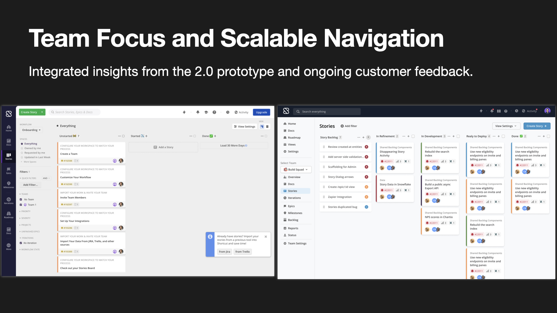
The career arc has mostly happened inside platform products: Pivotal Cloud Foundry, GitLab, Shortcut, and Nexla. The domains changed, but the job kept repeating. Clarify how the system works, make the next decision easier, and leave the team with a reusable decision pattern.

The leadership thread is that product structure and team structure move together. The strongest fit is a product with real operational stakes, where better UX also means better handoff, better review, and fewer surprises in delivery.

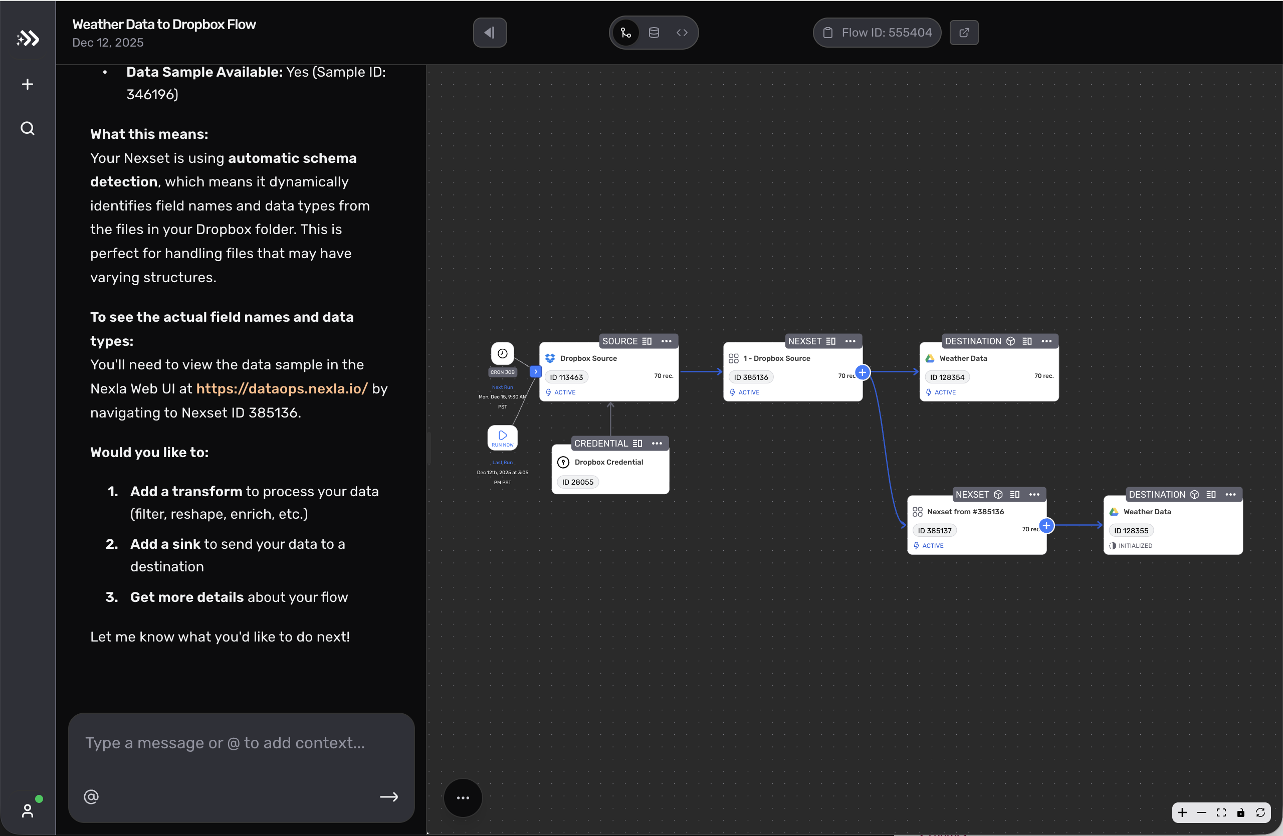
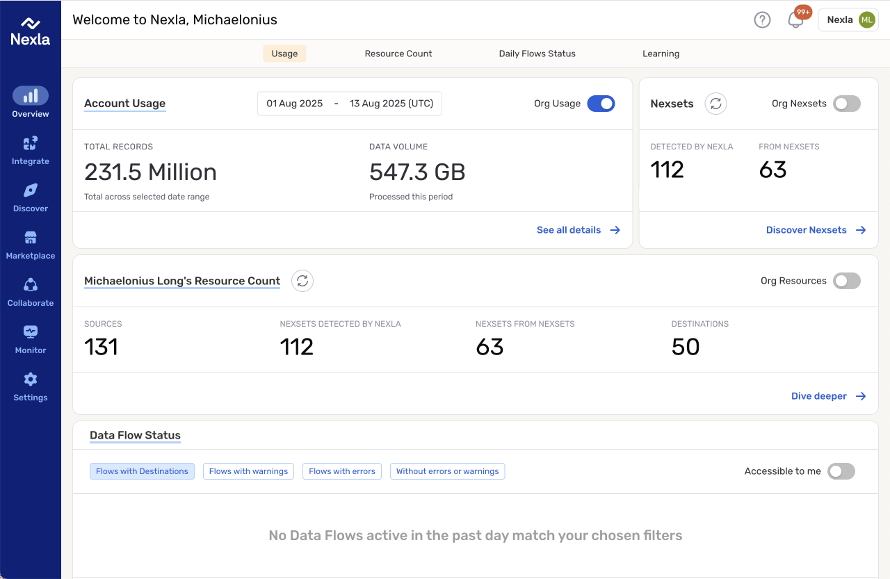
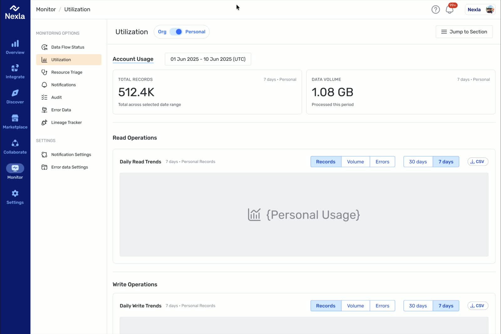
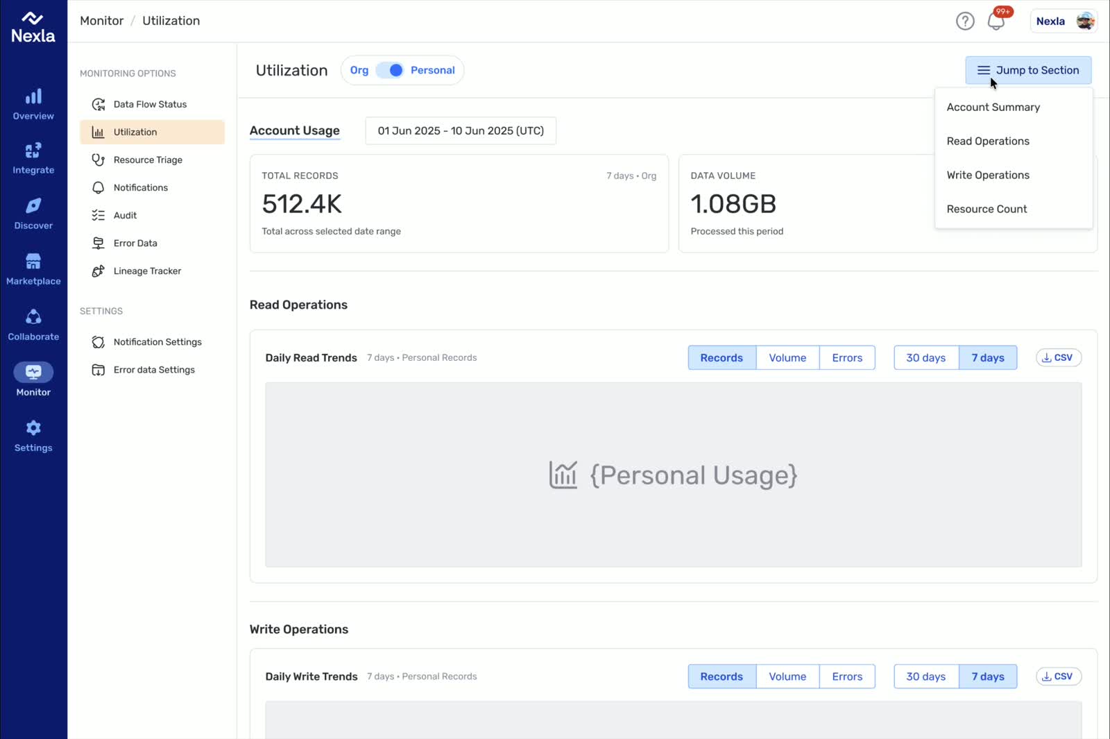
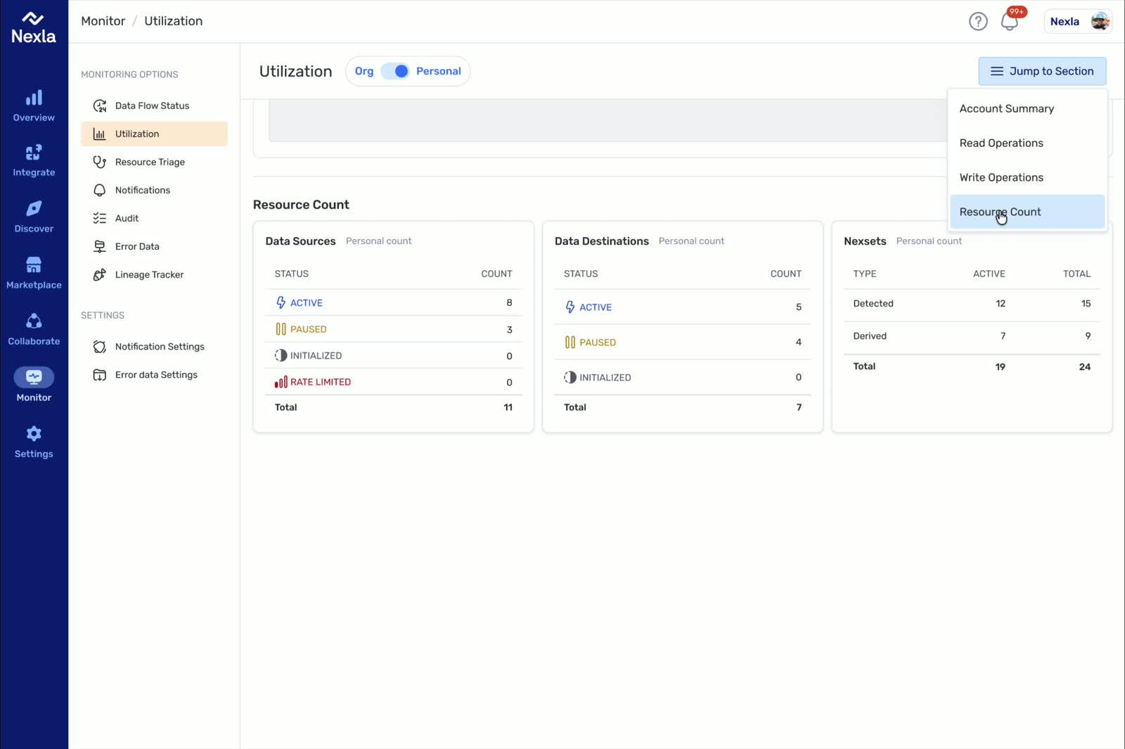
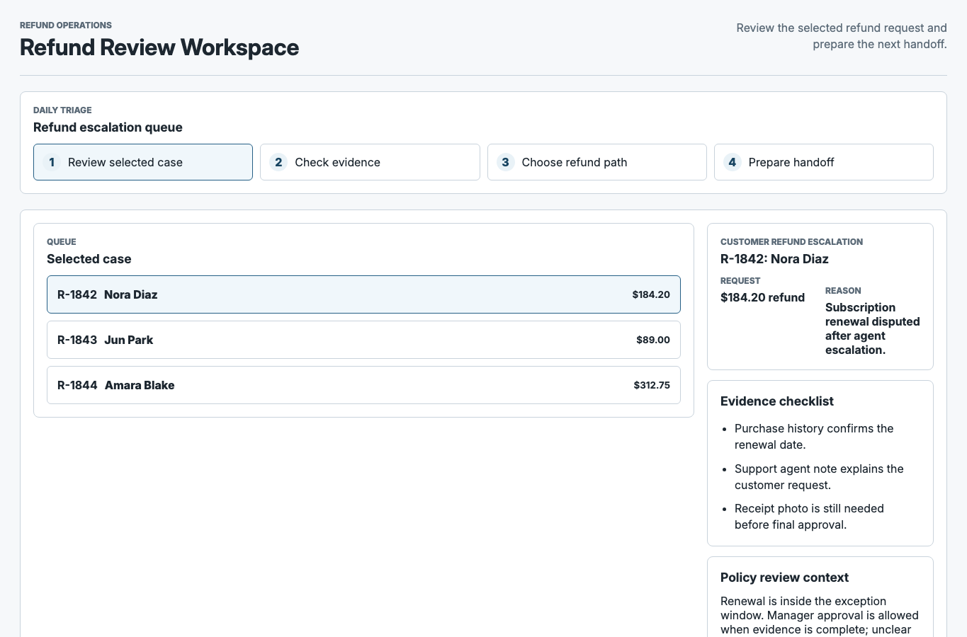
Nexla: Workflows Where Trust Matters

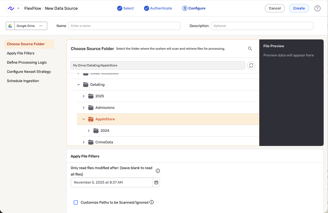
At Nexla, the work started as the first full-time design role and involved direct partnership with the CEO and product leadership across more than 50 surfaces. The core challenge was not just interface polish. It was turning connector-heavy workflows into something users could actually review, trust, and recover from when the system hit real-world complexity.

That work included a new 0->1 product, improvements to the core platform, and repeated decisions about how much automation to introduce without hiding the state users needed to see. The useful outcome was a more disciplined rule for AI in the product: automate where it helps users move faster, but keep review, data movement, and recovery visible.

Nexla workflow before redesign
Nexla workflow after redesign
After: After iteration and redesignBefore: Old UI before iteration and improvement

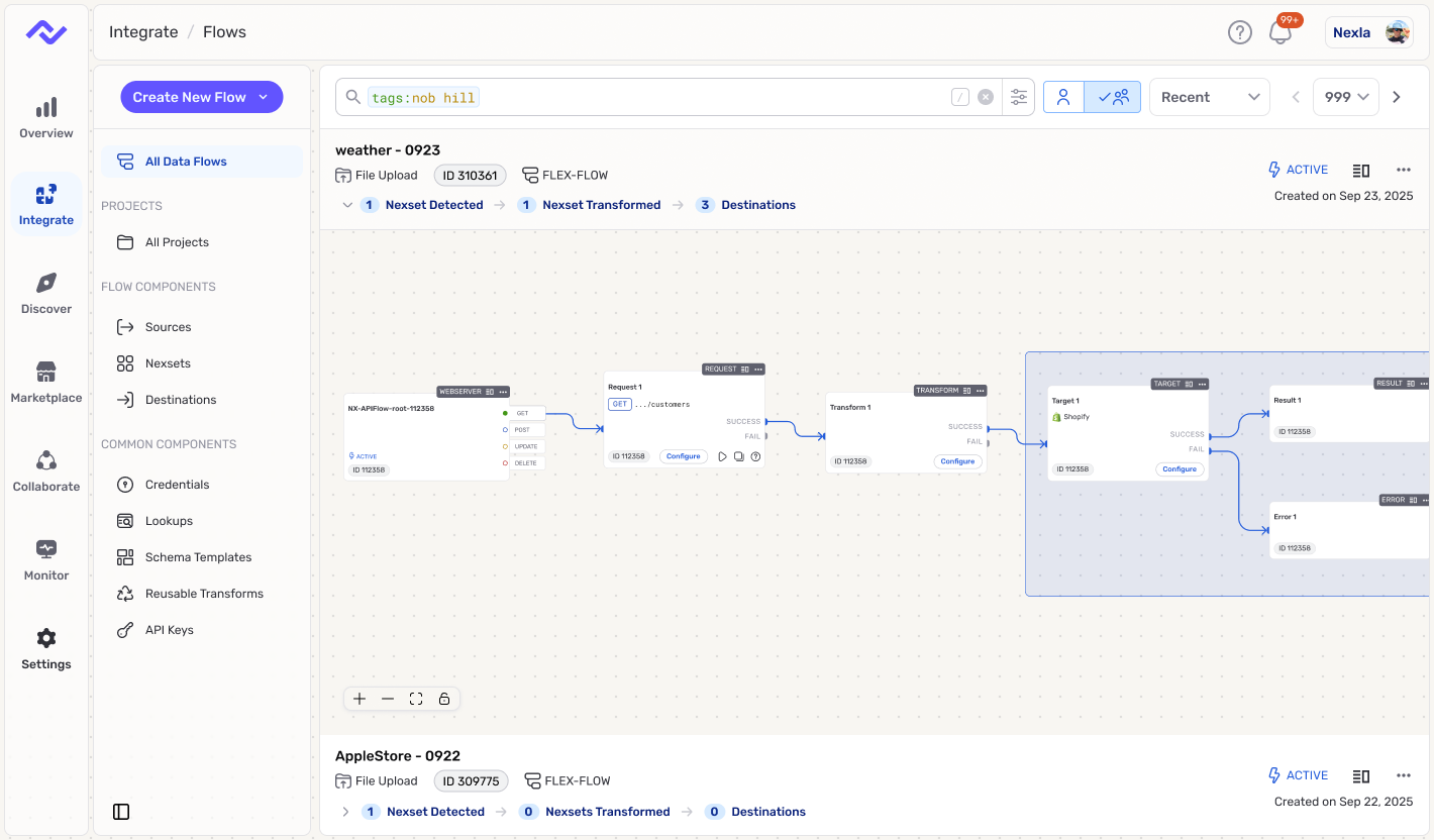
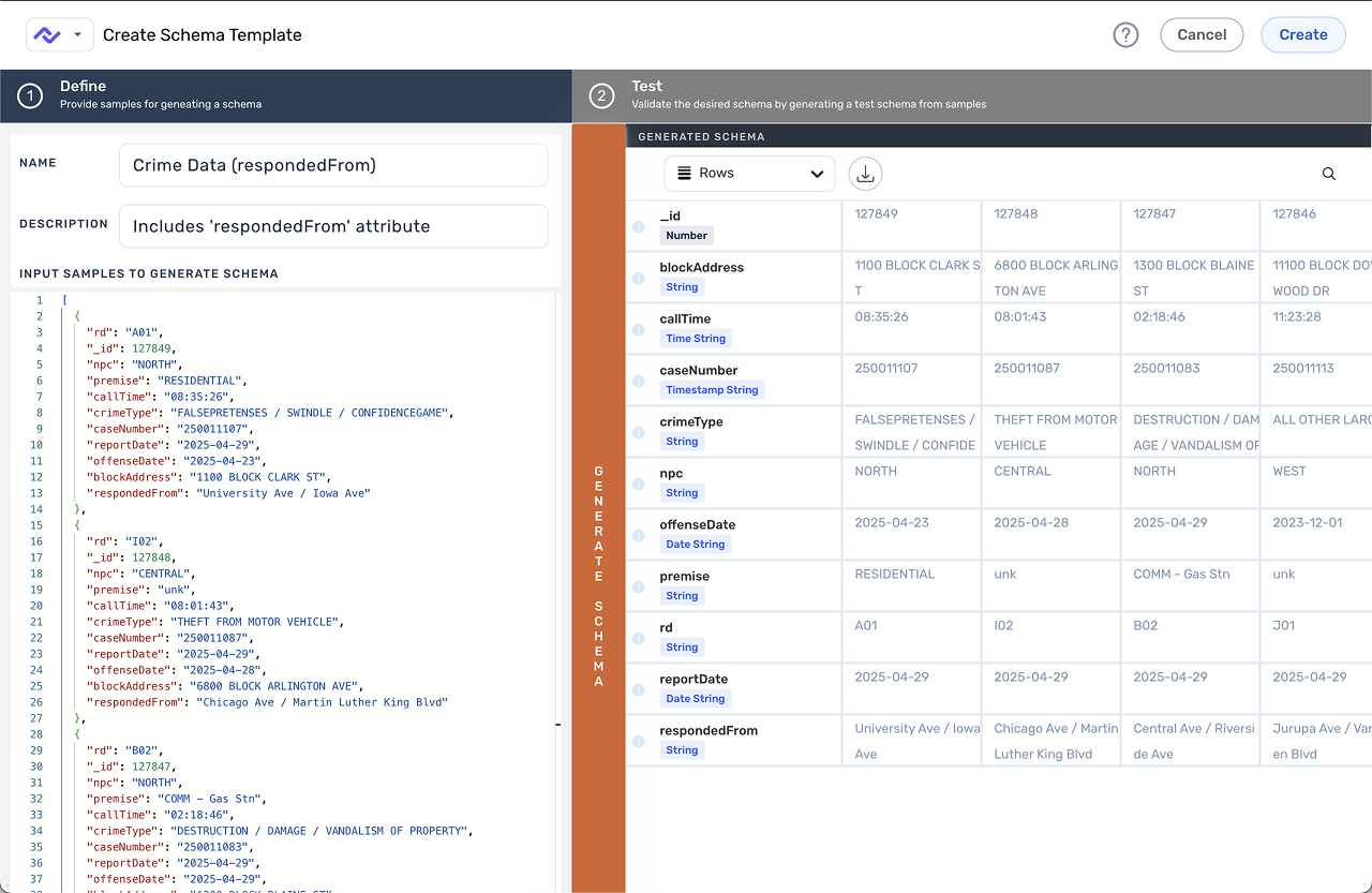
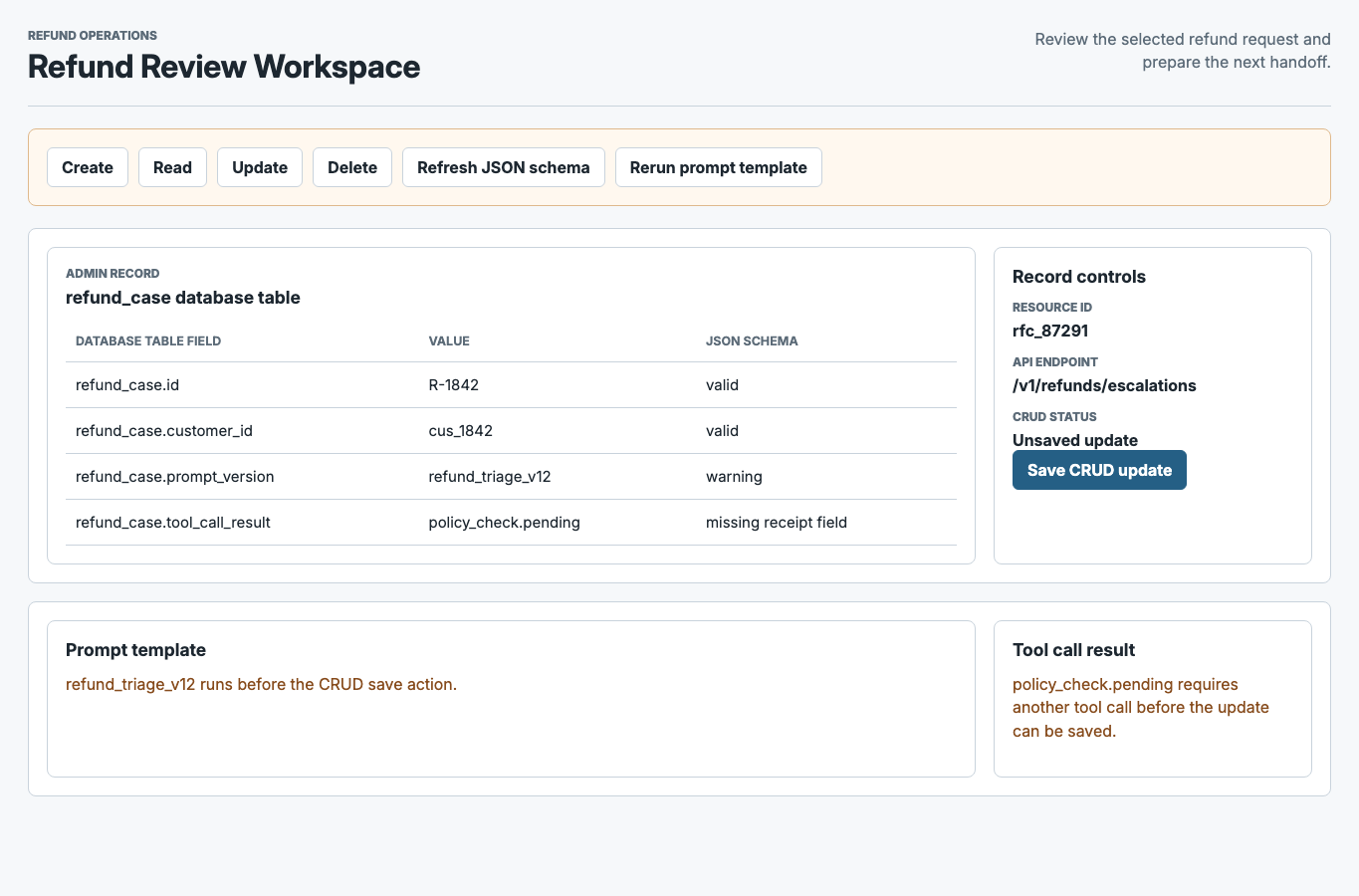
AI Inside the Workflow (Not a Side Chatbot)

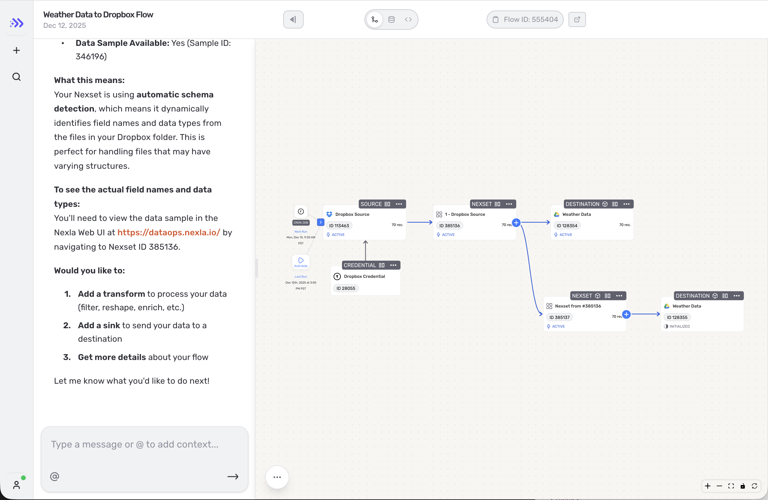
The AI pattern that holds up best is assistance embedded in the workflow itself. The system can propose a mapping, transform, or next action, but the user still needs to understand what changed, preview the effect, and intervene before anything irreversible happens. In practice, that means propose -> preview -> apply, with guardrails and review points built into the product instead of pushed to the margins.

That distinction matters in enterprise and system-of-record contexts. When mistakes carry real cost, "helpful" is not enough. Users need to see permissions, reversibility, logs, and where data will move, and teams need patterns consistent enough to ship that behavior more than once.

Execution pattern diagram

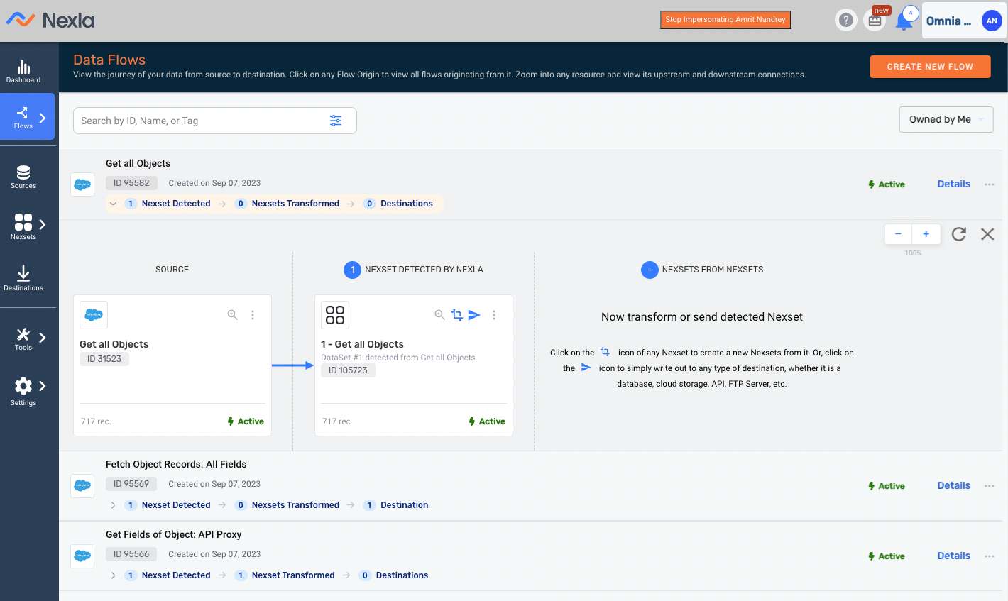
One Shared Platform Experience Across Two Products

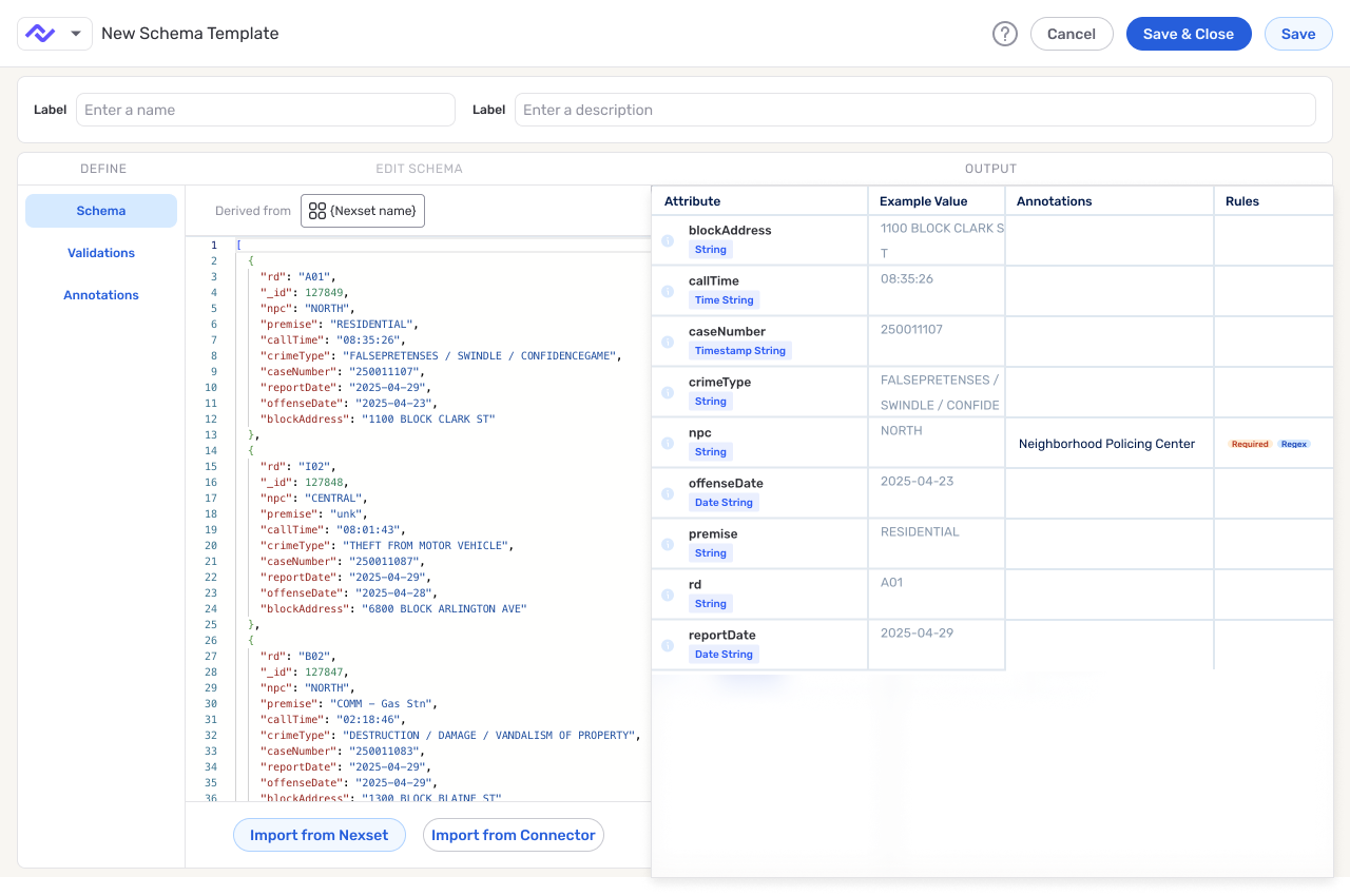
As the product footprint expanded, the design problem expanded with it. We helped unify the core platform and Express.dev so they felt like one company had built them, not two adjacent tools with different standards. That meant defining tokens, components, and workflow patterns for connectors, schema, review states, and execution feedback, then testing those standards through prototypes, implementation reviews, and shipped changes.

The operating rhythm was part of the design work. Standards only mattered if they survived design review, code, PR feedback, and production iteration.

Why This Role

This portfolio is built around products where mistakes are expensive: data movement, automation, generated steps, permissions, and review. Advanced capability only helps when users can see what changed, what will happen next, and where they can intervene.

That is why the cases focus on workflows instead of isolated screens. The work is to make difficult actions easier to inspect, turn good decisions into repeatable patterns, and keep AI assistance inside behavior users and teams can review.

Case Map

Two Proof Cases Behind the Narrative

The two proof cases below show that pattern from different angles. Express.dev deals with generated UI inside flow setup: the assistant can move work forward, but only if credential states, completion signals, and the canvas handoff stay visible. Schema Template Designer deals with dense product complexity: templates had to become a usable contract model before the UI could feel reliable.

Together, they show the same standard in two forms: generated steps and contract models that expose state, preserve review, and give teams decisions they can build on.

Custom Code Flows

Turned a fragile custom-code prototype into a source -> code -> destination workflow with explicit state, faster testing, and shippable v1 scope.

Fast Read

Executive Summary: Fewer Steps, More Clarity

Problem (why leadership cared)

Custom code was powerful but behaved like an internal tool:

  • Testing was slow/painful
  • Errors + state were opaque
  • Key actions were buried or required copy/paste
  • UI patterns were inconsistent across the product

Solution (what shipped as a workflow)

A guided, IDE-like authoring experience:

  • Full-screen code editor + console
  • Flow template on canvas (Source -> Code -> Destination)
  • Explicit file selection + preview/download
  • Simplified "write new vs library" without disruptive modality

Summary

Setup: Who the Custom-Code Workflow Serves

Primary Users

  • Data engineers
  • Platform engineers
  • Solution architects

Typical jobs-to-be-done

  • Normalize messy vendor files (PDF/CSV/JSON)
  • Validate, enrich, or reroute records
  • Debug issues quickly without needing support

Problem

Persistent Workflow Friction in Real Feedback

"Much of it is user experience... the same things that people have complained now for over two years on usability."

Internal review (Nov 2025)

"The flow to do that is really counterintuitive... you need to put a file path... hard-coded... then copy/paste."

Internal review (Oct 2025)

"The test here is slow and painful... you can't debug... error message is not easy."

Internal review (Oct 2025)

Design questions we had to answer

  1. What is the minimal "developer-grade" workspace?
  2. How do we make next steps obvious on the flow canvas?
  3. Where does code live: in source config or as a first-class node?
  4. How do we support both "write new" and "reuse from library" without confusing mode switches?

Context

First Attempt: Why the Drawer Model Failed

Why a right-side drawer initially made sense

  • Fast to implement using existing panel pattern
  • Reduced risk while backend behavior was still shifting
  • Kept canvas visible (in theory)

What we learned quickly

  • Too little space for real code
  • Documentation and controls competed for real estate
  • It encouraged a brittle, modal workflow
Custom code right-side drawer modal used in the initial authoring model

Custom Code v1 Reality Check Before Redesign

  1. Folder-first setup started in a dense multi-step shell.
  2. Filters, processing, and scheduling competed in one long configuration surface.
  3. Turning on custom processing introduced an immediate mode branch.
  4. Testing UI appeared before file-path context was concrete.
  5. Output panes consumed space while primary guidance remained thin.
  6. Reusable processor selection interrupted flow with a full-screen modal.

Approach

Turning Point #1: Promote Custom Code to a Full Workspace

What changed in the design

  • Promote code to a primary task
  • Keep console/results persistently visible
  • Reserve right rail for "contract + runtime config"

Why this mattered

  • Less scrolling
  • Fewer hidden controls
  • Better parity with real developer workflows

Discovery and Evidence

Turning Point #2: Template-First Flow Guidance

  • Users needed a guided sequence
  • New flows start with nodes already on the canvas
  • Template-first setup lowered setup uncertainty
Flow guidance sequence showing pre-seeded nodes and template-first setup

Solution

Turning Point #3: Stable Write New vs Library Mode

"We have multiple patterns in the UI in how we handle the custom code... we need a consistent pattern."

Internal review (Nov 2025)

"When I go to provide your own function, we have some code already... Half the screen is documentation... confusing."

Internal review (Nov 2025)

Design move

Make the choice explicit upfront, then keep users in a single, stable editing mode.

  • "Write new" generates stub + contract
  • "Select from library" previews code before insert
  • Avoid disruptive state resets

Implementation detail that mattered

A state machine defined valid transitions so we could:

  • Prevent impossible states
  • Show consistent CTAs
  • Reduce edge-case warnings

Implementation

Make Iteration Fast: File Access + Runtime Feedback

File access (in-product)

  • Select a file from the chosen folder (no path copying)
  • Preview or download the original file
  • Keep folder context visible while coding

Local debug (out-of-product)

  • Provide a Docker-based harness that mimics the custom-code runtime
  • Clear guidance on contracts for local vs cloud
  • Long-term: CLI deploy from IDE (future)

"You cannot just select it from here and test it right away… copy this path… paste."

Internal review (Oct 2025)

"The only caveat is… we need a public-facing repository with the Docker image…"

Design review (Nov 2025)

"Telling them to bring the code in our UI and just run it… is always going to be painful. Debugging breakpoints will be hard."

Internal review (Nov 2025)

Results

Increased Delivery Precision

What we did

  1. Used AI to draft a state model
  2. Fed the model into Figma Make
  3. Iterated quickly with stakeholders

Why it mattered

  • Stakeholders reacted to proposed behavior
  • Captured edge cases early
  • Reduced "hand-wavy" ambiguity
Simplified state model with four lifecycle states and JSON payload example

Reflections

Collaboration and Scope Discipline Made v1 Shippable

How we drove clarity

  • Used interactive prototypes to get fast, specific feedback
  • Kept a v1 scope line (basic workflow first)
  • Clarified "v1 vs later" with Head of AI + Customer Success engineering
Design journey timeline showing progression from friction discovery to refined editor behavior

Schema Template Designer

Reframed schema templates as reusable data contracts, then defined the authoring and apply behavior engineering could build.

Fast Read

Executive Summary: From Ambiguous Templates to Shippable Contracts

Problem (why this mattered)

  • What changed: Reframed schema templates as reusable data contracts that teams could author, preview, and apply inside the mapping workflow.
  • Why it mattered: The old feature captured field names, but left meaning, validation, and import behavior too ambiguous to trust.
  • Key design move: Defined one contract model - shape, validations, and annotations - then made the apply flow default to unmapped gaps.
  • Outcome: Product and engineering got one buildable contract model instead of another partial template surface.

Summary

Context & Users

When we joined this problem, "schema templates" already existed, but they were not yet functioning like reusable contracts. Teams could capture field structure, but they still had to rely on documentation and tribal knowledge to understand meaning, validations, and what would actually happen when a template was applied.

We reframed the work around a simpler promise: a template should help a team move from create to preview to apply without ambiguity. That shift turned the feature from a loose collection of authoring and mapping ideas into one workflow product and engineering could align on, build, and measure.

Before-state screenshot of schema template workflow issues
After-state screenshot of schema template designer with define, edit schema, and output panes

Problem

The UX debt

Most of the UX debt came from ambiguity, not missing capability. Mapped and unmapped fields were mixed together, calls to action changed meaning depending on context, and authoring still behaved like a sample-driven setup instead of a reusable contract definition tool. On the implementation side, the underlying system was already persisting separate JSON structures, which made it easy for technical complexity to leak into the user experience.

As one Eng/PM partner put it, "There's three separate JSON blobs I'm saving." The result was predictable: operators had to interpret too much before they could trust an import, and contract owners had no clear model for defining rules at scale. The feature existed, but the workflow did not.

System flow from template authoring to template apply and destination

Context

Principles & mental model

This work sat inside the dataset workflow, where two different users had to rely on the same system under deadline pressure. Operators needed a fast, low-risk path to close unmapped gaps. Contract owners needed to define structure, validations, and field meaning in a form that could survive repeated reuse.

As a product lead put it, "We were trying to add garnish... when we were missing a whole side." That constraint shaped the mental model. A template could not be just a list of fields, and it could not split into separate products for authors and consumers. It had to behave like one contract model expressed through two linked workflows.

Contract mental model diagram showing shape, validations, annotations, and contract preview

Approach

Solution 1: apply templates in the dataset workflow

We narrowed v1 around three decisions. First, applying a template should start with unmapped gaps, because that is where the operator's risk and attention live. Second, selection and import states needed to be explicit, so users always knew what was about to happen. Third, rules had to appear close enough to the workflow to teach, not disappear into documentation.

That approach kept the work grounded in real tasks instead of trying to solve every future scale concern in v1.

Horizontal apply flow and simplified after wireframe using flow-diagram styling

Discovery and Evidence

Solution 2: validations at scale

The major tradeoff in reviews was how much validation detail to show inline. An inline model made scanning and one-click import faster, which mattered in the mapping flow. A tabbed model would scale better as rule density increased, but it also risked pushing essential context out of sight too early.

We chose to ship the inline model for v1 because the immediate problem was not information overload; it was decision confidence. The fallback was deliberate: if teams later outgrew inline presentation, tabs were a scale strategy, not a prerequisite for shipping.

Model A inline table and Model B tabs wireframe comparison with decision strip

Solution

Solution 3: author templates

The final interaction model treated authoring as three inputs feeding one trusted preview. Shape came from sample data or pasted JSON. Validations could be defined through guided controls or JSON. Annotations captured field meaning so downstream users could understand intent, not just structure.

On the apply side, the workflow kept operators focused on unmapped fields first, made bulk selection predictable, and clarified import states before changes landed. Together, those moves made the template behave like a reusable contract instead of an ambiguous helper.

After-state screenshot of schema template designer with define, edit schema, and output panes

Implementation

We turned the model into behavior engineering could build: default to unmapped fields, define select-to-import transitions, specify which authoring inputs fed the preview, and call out the edge cases where guided UI and JSON had to land on the same contract. The point was to remove decisions from the handoff, not make a prettier Figma path.

The v1 spec also named what we were not solving yet: dense validation navigation, governance signals, and heavier rule management. Those became follow-on paths after the core create -> preview -> apply loop existed.

Results

Outcome and evaluation plan

The immediate result was alignment around one buildable contract model. Product and engineering could review the same behavior, and users had a path from field definition to application that did not require interpreting scattered docs and JSON behavior.

The measurement plan focused on time to valid output, select-to-import conversion, post-import edits, and support signals. Those metrics matter because they reflect the underlying goal of the redesign: fewer ambiguous handoffs and fewer mapping incidents caused by unclear contract behavior.

Reflections

Learnings & next steps

This reinforced a familiar enterprise UX lesson: when a feature is confusing, adding more places to configure it often makes the problem worse. Here, progress came from narrowing the promise: define the contract, preview the effect, and apply it to unmapped fields.

Taking this further, the next step would be usability testing with operators using real templates, followed by governance and denser validation management. But the core handoff should stay the same: create -> preview -> apply.

Express.Dev Generative UI

Defined how generated forms, credential prompts, and canvas handoff should behave when AI-assisted setup gets uncertain.

Fast Read

  • What changed: Designed a prompt-first flow authoring experience where an agent could accelerate setup without hiding the underlying workflow.
  • Why it mattered: Generated UI was only useful if users could understand what the system was doing, trust the next step, and recover cleanly when automation failed.
  • Key design move: Treated the work as an interaction-contract problem - constrain the agent's behavior, expose system state, and make fallback to manual editing explicit.
  • Outcome: The team had a reusable interaction model for future generated forms, quick actions, and canvas handoffs.

Summary

This case is about deciding how generated UI should behave when real connector setup gets uncertain. The goal was not to make the experience feel magical. It was to make prompt-first setup useful while preserving the visibility and control technical users needed when credentials, connectors, or generated steps became unreliable.

We defined how generated forms, quick actions, and credential prompts should behave so users could understand what the system was asking, why it was asking it, and when to stay in the guided path versus move to the canvas for manual control.

Express.Dev flow canvas in light mode
Express.Dev flow canvas in dark mode

Problem

Prompt-first authoring lowered the barrier to getting started, but it also created a new trust problem. When credentials failed, generated steps stalled, or connector behavior was inconsistent, users had too little context to tell the difference between a recoverable issue and a broken path.

That made the product feel asymmetrical: fast when the happy path held, but opaque when reality intruded. For a workflow product, that is a serious issue. Users do not just need acceleration. They need a reliable way to understand state, make the next decision, and recover without starting over.

Context

The experience was powered by an XML DSL that let the agent generate interface components on the fly. That flexibility was powerful, but it also meant the product needed a stronger interaction model than a traditional handcrafted flow. Without clear constraints, generated forms and actions could vary in ways that felt unpredictable or hard to trust.

The design challenge was to support two legitimate user needs at once: a guided path for people who wanted to move quickly through prompts, and a reliable escape hatch for people who needed the precision of direct canvas editing.

Approach

We treated the work as an interaction-contract problem. The agent could only be useful if the product constrained what it could ask for, clarified the role of each generated component, and defined what happened when the guided path no longer had enough confidence to proceed.

That meant reviewing each generated step against a practical checklist: what state is visible, what action is safe, what retry path exists, and when should control move back to the canvas?

Discovery and Evidence

In reviews, generated steps landed best when they were inspectable: a credential choice with a clear consequence, a quick action with an obvious next state, or a canvas handoff users could recognize. Confidence dropped when credentials were invalid, actions appeared complete before backend sync finished, or a connector returned a state the UI could not explain.

The issue was not simply "AI made a bad suggestion." The product was too quiet at the exact moments users needed orientation. Was this retryable? Was it safe to continue? Should they move to the canvas and take over manually?

Solution

The design kept prompt-first setup, but made each generated component answer a practical question: what is being asked, what changed, and what can the user do next? Forms and quick actions stayed in the guided path, while the canvas remained the place for direct editing when the generated path ran out of confidence.

Manual editing became a normal branch of the flow, not a failure state. That let the assistant speed up setup without asking technical users to keep trusting it after credentials, connectors, or generated steps got messy.

Implementation

We partnered closely with engineering around the reliability moments most likely to shape user trust: credential selection, recoverable failure states, and completion signals that stayed honest when the backend still had unresolved work. The implementation goal was not to promise more automation. It was to make the assisted path dependable under real connector constraints.

That required discipline in both product language and interaction behavior. We prioritized the states the team could defend, clarified the points where user control resumed, and avoided design decisions that would make the system feel more capable than it really was.

Results

The user-facing result was a setup path that made assistant state visible, showed where control resumed, and explained how to proceed when the guided path stopped being the best option.

Outcomes

For the team, the work created a reusable baseline for future generated forms and quick actions: every assisted step needed a visible state, a clear handoff, and a recoverable next move.

Reflections

Users trust AI-assisted setup more when the boundaries are visible. They can accept automation when they can see state, understand confidence, and know exactly how control returns to them.

That principle applies beyond this case. In AI-heavy products, adding more intelligence is often less useful than making the existing intelligence easier to inspect, correct, and recover from.

Design Org Foundations

Built the design organization's first shared ladder and performance framework, then tied it to coaching, calibration, and product partnership.

Fast Read

  • What changed: Built shared career ladders across product design, brand, and research, then turned them into a usable performance and coaching framework.
  • Why it mattered: The team had strong people, but no consistent way to define growth, calibrate expectations, or repair weak product/design partnership.
  • Leadership move: Created one common language for scope, craft, and leadership, then tested whether it worked in real manager conversations.
  • Outcome: Designers had clearer growth paths, managers had a more reliable coaching tool, and product/design leaders had a practical way to make expectations explicit.

Summary

The work started during a period of growth when design needed more structure, not just better output. The immediate challenge was to create clear career paths across product design, brand, and research while also rebuilding trust between design leadership and partner functions.

We built a shared ladder and performance framework so expectations were explicit, comparable across disciplines, and usable in coaching and calibration. The useful outcome was not the document itself. It was giving managers language they could use in one-on-ones, promotion conversations, and product/design planning without inventing local rules every time.

Design department accomplishments slide showing design system team, research leadership, brand perception research, onboarding survey, specialized roles, rituals, and experimentation

Problem

The organization had talented designers, but it did not yet have a shared way to talk about level, growth, or cross-disciplinary expectations. Managers were being asked to evaluate scope, craft, and leadership without a common language, which made calibration inconsistent and made advancement harder to explain or defend.

That ambiguity affected more than performance cycles. It also weakened product/design partnership because unclear expectations tend to create unclear ownership, uneven feedback, and lower trust in how decisions get made.

Shortcut problem slide listing low trust, hand-off issues, dismissed research, no career pathing, outdated product, and declining conversion

Context

The team was already shipping work across product, brand, and research, so the answer could not be a long internal strategy exercise detached from delivery. Any new framework had to work while the organization was still moving, and it had to support both managers trying to coach well and designers trying to understand what growth actually looked like.

That created the central constraint for the work: move quickly enough to help the team now, but build something durable enough to support future hiring, compensation, and promotion conversations.

Approach

We started by defining a shared set of principles for how the organization should talk about scope, craft, and leadership, then translated those into discipline-specific expectations for product design, brand, and research. The point was not to build a perfect framework on paper. It was to create language managers could use immediately in one-on-ones, feedback, and calibration.

We pressure-tested the model with peer leaders and coaching networks to make sure the ladders were clear without inflating titles or creating discipline-specific silos. That kept the framework practical and made adoption more likely once it moved into real use.

The 2.0 prototype proved we could simplify the surface, but critique also showed how little reusable brand structure we had. That pushed the work beyond cleaner screens toward a system the team could actually repeat.

2.0 prototype comparing the old Shortcut app with a cleaner refreshed directionShapes design-system sheet showing reusable icons and brand forms that resolved the sparse prototype direction

Discovery and Evidence

Reviewing manager notes, feedback patterns, and recurring confusion in growth conversations made the root issue clear: similar impact was being described differently depending on whether the work came from product design, brand, or research. That made fair calibration harder and weakened confidence in the system.

Cross-functional conversations also showed that product/design friction was partly structural. Without a shared model for scope and accountability, teams defaulted to local interpretations, which increased misalignment. The product visuals in this case should be framed as supporting evidence of that broader alignment problem, not as standalone proof that the ladder work caused each product change.

Solution

The final package had three pieces: ladders tailored to each discipline, a shared competency model, and a performance framework that translated expectations into coaching language. We mapped scope, collaboration, and leadership behavior so managers could compare impact across product design, brand, and research without each group inventing its own standard.

Then we put the language into a regular coaching rhythm. The ladders were not just there to explain promotions. They became a way to make feedback and development plans more specific, and gave product/design leaders a less personal way to talk about ownership and decision boundaries.

Shortcut slide showing team focus and scalable navigation with side-by-side product views

Implementation

We rolled the framework out iteratively rather than treating it like a top-down announcement. Early drafts went through managers and designers first, because the test was whether the language held up in real conversations, not whether it looked complete in a presentation.

Within about the first month, we had a usable version with enough buy-in to support live coaching and calibration. From there, the work shifted from definition to adoption: tightening unclear wording, using the model in performance discussions, and reinforcing the same expectations in cross-functional planning.

Results

The organization came away with a more credible growth system across product design, brand, and research. Designers had clearer visibility into what advancement required, and managers had a more consistent tool for coaching, calibration, and promotion readiness.

Outcomes

The framework also gave product and design leaders a clearer basis for discussing expectations, ownership, and collaboration. That does not prove partnership was fully fixed on its own, but it made later decision-making less dependent on personal interpretation.

Reflections

Org-design work needs the same discipline as product work, but the test is behavior change. The framework mattered only if managers used it when the stakes were real. We rolled it out while work was still moving, tested the language in live conversations, and traded theoretical completeness for something people could use that month.

If the work were revisited, the first change would be adding adoption measurement earlier so future revisions could be driven by evidence instead of manager anecdotes alone. The core decision would not change: start with clarity people can use now, then scale the system once trust is established.

Overview Dashboard Enhancements

Moved dashboard context from repeated local controls to one page-level mode, with navigation and scope boundaries the team could defend.

Fast Read

  • What changed: Reorganized the overview dashboard around one page-level org/personal mode, clearer section hierarchy, and jump navigation.
  • Why it mattered: The original page repeated context decisions inside modules, used a lot of space, and still did not explain how the dashboard worked.
  • Process move: Separated the structural redesign from the chart work the team could not honestly finish in the same pass.
  • Outcome: The team shipped a more defensible overview without waiting for a broader analytics rewrite.

Summary

We redesigned Nexla's overview dashboard around one decision users were already making repeatedly: whether they were reviewing org-level work or personal work. The old page answered that question inside individual modules. The redesign moved the choice to the top of the page, cleaned up the section order, and kept the chart placeholders honest because reporting behavior was not part of this pass.

Problem

The original dashboard asked users to re-interpret context in every module. Separate org and personal toggles appeared across sections, there was no clear page-level mode, and the layout consumed a large amount of space without delivering corresponding clarity. Review feedback made the issue plain: people could read the cards, but the structure of the page did not explain itself.

Previous overview page: local toggles and section-by-section controls made the page model feel fragmented instead of establishing one clear context up front.

Previous overview page with repeated local toggles and a fragmented page model instead of one clear page-level context switch.

Context

The team needed a redesign that could ship on top of the existing overview framework while leaving room for the dashboard to grow. That meant making the current page easier to understand immediately, but also introducing navigation and structure that would still work once more overview sections and reporting surfaces were added.

Approach

We treated the page as an information architecture problem. One mode switch should set context for the whole dashboard. Sections should inherit that context instead of asking the user to re-decide it. The jump menu came from the same logic: if the overview was going to grow, users needed a way to move to a real section instead of scrolling through a long stack of cards.

Redesign baseline: one page-level Org and Personal mode control replaced repeated local switches and gave the whole page a more coherent structure.

Redesigned overview page with a single page-level Org and Personal toggle plus CSV export controls within the section modules.

Discovery and Evidence

A recording-backed product walkthrough surfaced three problems: there was no global mode switch, the page used a lot of space without adding much information, and every section taught the same context rule again. It also clarified the scope line. Charts were not ready for deeper redesign, so the useful work was structure, navigation, and practical actions like CSV export.

Solution

The shipped dashboard sets org versus personal mode once, at the top of the page, then lets the modules inherit that choice. The jump-to control gives users a direct route to summary, read, write, and resource sections. Where the team had not solved reporting depth yet, the page keeps the placeholder regions visible instead of pretending the analytics model was finished.

Scalable navigation: the Jump to Section menu makes future dashboard growth legible without falling back to repeated local controls.

Redesigned overview page with the Jump to Section menu open to show scalable navigation across summary, read, write, and resource modules.

Implementation

Design and engineering aligned around a narrow set of decisions the team could actually defend in implementation: centralize the page mode switch, improve wayfinding, preserve placeholder chart regions where redesign work had not happened, and add CSV downloads where operators would benefit from extracting data. That balance kept the redesign useful and shippable without hiding unresolved analytics work.

Concrete destination: the Resource Count section shows how the new navigation model lands users in a specific part of the overview instead of leaving the page as one long undifferentiated stack.

Redesigned overview page landing in the Resource Count section after section navigation, showing concrete destination-level detail for the new overview model.

Results

After the redesign, the page read more like one dashboard instead of a collection of unrelated modules. Users could set context once, move through sections with a predictable menu, and export useful data without waiting for a larger analytics rewrite. The chart areas still showed the future work instead of hiding it behind finished-looking chrome.

Outcomes

  • Replaced repeated section-level switches with one page-level mode
  • Added jump navigation for summary, read, write, and resource sections
  • Kept chart redesign out of scope while adding practical CSV export paths

Reflections

The useful decision was resisting the urge to make every gray box feel finished. The page needed a better mode model and section order first. Once those were clear, the team could ship a better overview without making weak claims about chart behavior that had not been redesigned yet.

Flow Creation Improvements

Moved flow creation from internal taxonomy to task-first setup while preserving backend contracts and role-based behavior.

Fast Read

  • What changed: Shifted flow creation toward task-first setup so users could start with intent before choosing internal flow types.
  • Why it mattered: Early flow-type decisions created avoidable confusion in onboarding and made setup feel more brittle than it needed to be.
  • Process move: Used review evidence to separate copy/action mismatches from backend constraints that could not move in the same release.
  • Outcome: The team shipped a lower-risk sequencing improvement without rewriting flow orchestration.

Summary

We moved the flow creation entry toward the thing users understood: what they were trying to connect or set up. The old path asked them to pick from internal flow types too early. We moved that product complexity later, after the user had enough context to make the choice.

Problem

The product asked users to pick a flow type too early. Team conversations showed that users wanted to connect to systems first and only then handle flow-specific details. This mismatch caused confusion in onboarding and slowed setup completion.

Context

The platform supported multiple flow types with different backend and wizard behaviors. Some flow paths were still half-baked and exposed to users. The team needed to reduce user-facing complexity without hiding product power.

Approach

We iterated toward a task-first sequence: make the initial call to action map to user intent, then defer flow-type complexity to later steps. The process stayed deliberately incremental because backend contracts, parallel PRs, QA capacity, accessibility, and role-based actions all had to survive the change.

Discovery and Evidence

Weekly design, product, and engineering reviews kept circling the same issues: users did not know which flow type to choose, some metric ideas could not be backed by available APIs, and a few actions looked equally ready even when permissions or implementation state said otherwise. That gave us a practical cleanup list instead of a broad onboarding rewrite.

Solution

The revised interaction model introduced clearer resource cards, simpler call-to-action mapping, and permission-aware actions. We preserved visibility for non-admin users while gating actions they could not execute.

Implementation

Design and engineering reviewed edge cases in active/paused state semantics and reconciled API limitations with product language. We treated missing metrics as explicit scope cuts and documented follow-up work.

Results

The shipped iteration moved flow-type complexity later in the path, made resource cards easier to act on, and kept permission-limited actions visible without pretending every user could run them. It also gave the team a cleaner base for later modal and dropdown creation patterns without blocking the current release.

Outcomes

  • Reduced early-step confusion by shifting flow complexity later in the journey
  • Improved action clarity in onboarding and resource management surfaces
  • Created a safe path for iterative rollout with existing backend contracts

Reflections

The lesson was sequencing. Users can usually answer the goal before they can answer the internal mode. The next pass should measure setup drop-off and action completion earlier, so the team is not relying only on review notes to decide where the flow is still confusing.

agent-memory-mcp

Built a shared local memory layer that lets Codex, Claude Code, and other MCP clients reuse durable project context across sessions.

Snapshot

agent-memory-mcp started as a practical fix for a recurring workflow problem: every local agent session could reason well in the moment, but useful context kept fragmenting across tools and threads.

The project turns that into a shared local memory layer so multiple MCP clients can retrieve durable context without forcing teams into a single editor, host app, or orchestration shell.

Context

This sits in the part of the workflow most agent tools currently skip over: durable project memory that survives beyond a single session and can be reused across different local clients.

For the people actually using Codex, Claude Code, and similar tools day to day, the gap was not raw model quality. It was the cost of reestablishing context every time they changed threads, tools, or tasks.

Problem

  • Local agent workflows were fast, but project memory was trapped inside whichever tool happened to be active.
  • Repeated prompts recreated the same context instead of compounding on prior decisions, constraints, and repo facts.
  • Teams needed something local-first and inspectable, not a black-box hosted memory service bolted onto one client.

Build

Shared local memory layer

  • Scoped memory capture keeps repo facts, decisions, and user preferences retrievable without mixing unrelated work.
  • SQLite storage keeps the system local, portable, and easy to reason about during development.
  • MCP-native tools handle capture, search, dedupe, and upsert so different agent clients can participate without custom glue per app.
Overview diagram from agent-memory-mcp showing Codex, Claude Code, and other tools sharing a local MCP memory layer.

Impact

  • The project turns memory from client-local residue into a shared working layer that can actually compound across sessions.
  • Designing for multiple agent clients forced the system toward clearer contracts, explicit scoping, and a local-first storage model.
  • As a Labs pilot, it also proved this work reads better as a case study when the narrative ties infrastructure choices directly to workflow outcomes.

Repository: github.com/mikeylong/agent-memory-mcp

JudgmentKit MCP

Built an activity-first MCP that helps agents review UI work before generation, keeping prompts, schemas, tool calls, and review packet terms out of the product surface.

JudgmentKit social thumbnail with the JudgmentKit mark and the phrase Before the UI.

Snapshot

JudgmentKit MCP started from a specific failure mode in AI-generated interface work: agents can produce polished screens before they understand the activity those screens are supposed to support.

The project turns that into an MCP-native review layer. Before generation, an agent can name the activity, translate it into interaction responsibilities, define what should stay hidden, and create a tighter handoff for implementation.

Context

AI UI work often breaks when the implementation model becomes the user experience. Tables become screens, schemas become forms, prompt templates become product vocabulary, and tool results become buttons.

JudgmentKit sits before that moment. It gives Codex, Claude, and other MCP clients a shared way to review the work before they generate the UI, without making any single frontend stack or design system the center of the product.

Paired artifact evidence

The repo includes deterministic demos and paired artifact evals so the project can be judged against visible output, not just a better-sounding method. This refund triage pair shows the core shift: the raw screen follows implementation machinery, while the guided screen follows the review activity.

JudgmentKit-guided refund triage UI organized around case review and handoff decisions
Raw refund triage UI baseline with CRUD controls and JSON schema language
Raw: Implementation controls and schema language lead the surface.Guided: Case review, evidence, policy context, and handoff decision lead the surface.

Problem

  • Raw generation prompts were too easy to follow literally, even when they leaked database fields, JSON schema terms, resource IDs, or tool-call state into primary UI.
  • Visual polish could hide that the screen was supporting the wrong activity or asking the user to reason in implementation terms.
  • Teams needed a portable guardrail that worked before implementation, not a post-hoc critique after the wrong interface had already hardened.

Build

Activity-first kernel

  • ActivityModel describes the work: participants, objective, outcomes, artifacts, rules, and division of labor.
  • InteractionContract translates that activity into user actions, decision support, meaningful states, and completion criteria.
  • DisclosurePolicy decides what becomes user-facing, what gets translated into domain language, and what stays diagnostic.

MCP gates before UI generation

  • MCP tools create activity reviews, surface-type recommendations, workflow reviews, implementation contracts, and frontend generation handoffs.
  • The same guardrails apply whether the next step is deterministic, model-assisted, or handled by a separate agent.
  • Review-packet terms stay out of primary product UI; they remain available as diagnostics for setup, debugging, auditing, and integration work.

Impact

  • The project gives agents a better order of operations: understand the activity, review the workflow, define the implementation contract, then generate the UI.
  • It reduces implementation leakage by making disclosure a first-class contract instead of relying on the final prompt to remember what not to show.
  • As a Labs case, it shows that better AI UI generation often starts before pixels: with a reviewable model of the work, the decision, and what the product should not expose.

Website: judgmentkit.ai

codex-toolbar

Built a macOS menu bar utility that makes Codex rate-limit state plus 5h and Weekly usage pace visible at a glance, turning the next action into a one-click decision.

Snapshot

codex-toolbar is a small macOS menu bar utility for people who use Codex enough that rate limits become part of the working environment, not an occasional surprise.

The first version made the current limit state visible at a glance. The newer pass adds the more useful planning question: whether the current 5h and Weekly usage pace is likely to last through reset.

Context

Frequent Codex use creates a background coordination problem. You need to know whether you still have room in the current window, whether the tightest limit is about to reset, and whether today's pace is going to create a problem later in the week.

The local README makes the product constraint clear: this had to live as a real macOS utility, not a demo surface. It needed to run as an app, refresh reliably, and fit naturally into the menu bar habits of daily desktop use.

Problem

  • Rate-limit state was available, but not ambient. Users had to interrupt themselves to check it.
  • The cost of checking was out of proportion to the decision: open the app, inspect the limit state, then decide whether to continue.
  • Percentages answered the immediate quota question, but not the pace question. A limit at 75% remaining can still be safe or risky depending on how fast it is being consumed.
  • Once the state was visible, there was still friction getting back into Codex quickly enough for the signal to be useful.

Build

Popover states across the rate-limit curve

The popover needed to keep the pace chart visible while the rate-limit state changed, so normal, warning, and critical states stayed comparable without becoming visually noisy.

Projected 5h and Weekly pace

The charts make short and weekly limits planning surfaces. They compare the current point in each window, projected empty timing, and reset timing so the user can tell whether the limit is on pace to last or needs attention before reset.

Productize the everyday utility

  • Show a compact menu bar progress bar for the most constrained Codex window, including multi-week windows.
  • Open a popover with remaining percentages, reset timing, 5h and Weekly pace projections, and an Open Codex action when the desktop app is installed.
  • Refresh automatically on system clock minute boundaries and support manual refresh from the right-click menu.
  • Ship as a real .app with launch-at-login support so it behaves like an everyday desktop utility instead of a dev-only helper.

Impact

  • The product turns limit awareness and 5h/Weekly pace into a glance instead of a workflow interruption.
  • The projection chart moves the decision from "how much is left right now?" to "can I keep working at this pace?"
  • It closes the loop from signal to action by pairing ambient status with a direct route back into the Codex desktop app.
  • As a Labs case, it shows how a very small utility can still benefit from explicit product framing, state design, and enough polish to feel durable.

Repository: github.com/mikeylong/codex-toolbar

Website: codextoolbar.com

SkillSkill

Turned successful AI workflow sessions into reusable skill packages with explicit routing, output contracts, and validation across Codex and Claude.

Snapshot

SkillSkill came from a familiar failure mode in AI-assisted work: one session would finally produce a strong workflow, but the next person still had to reteach the same job from scratch.

The project turns that tacit know-how into a reusable skill package with a clear trigger, contract, edge cases, and example requests so the workflow can route and perform more consistently the next time it appears.

Context

Strong AI workflows rarely depend on the task statement alone. The useful part is usually the hidden discipline around what to include, what to exclude, how to structure the output, and how to handle messy inputs.

That knowledge is easy to discover in one good session and surprisingly hard to reuse afterward. Prompt snippets help, but they do not reliably tell an agent when a workflow should trigger or what a correct result must look like.

Problem

  • Good one-off sessions produced tacit instructions, not durable workflow assets.
  • Ad hoc prompts did not make routing or output expectations explicit enough for repeat use.
  • Cross-tool reuse was brittle when core method and platform-specific packaging details were mixed together.

Build

Package the workflow, not just the prompt

  • Write a canonical SKILL.md around routing description, contract, workflow, edge cases, and example requests.
  • Keep the method cross-tool by default, then add Codex or Claude packaging only when the caller actually asks for it.
  • Support create, revise, and critique paths so weak skills can be repaired instead of abandoned.

Add validation and packaging discipline

  • Ship a dependency-free validator that checks required files, one-line descriptions, contract coverage, examples, and packaging drift.
  • Include rubric and review-checklist references so quality expectations stay inspectable instead of living only in the author's head.
  • Add install scripts and committed package mirrors so the same skill can be reused across local Codex and Claude setups.

Impact

  • The project turns a good AI workflow session from ephemeral chat residue into a durable asset teams can reuse and critique.
  • It makes routing and output expectations explicit enough that repeated work compounds instead of starting from a longer prompt every time.
  • As a Labs case, it shows that productizing AI workflow knowledge often means adding contracts, validation, and packaging clarity, not more prompt cleverness.

Repository: github.com/mikeylong/SkillSkill